

My 3 Favorite Differences Between Squarespace 7.0 and 7.1
Squarespace launched a new platform in the middle of 2019 to a select few users. I was lucky enough to be one of those users, and I’ve immensely enjoyed the platform since. In 2020, they released it to the general public, and it’s now the only option when creating a site in Squarespace!
There are oodles of guides out there about the differences, but I wanted to highlight my favorites and explain why these three things make 7.1 my ideal platform.
Here’s Squarespace’s official article about their new platform.
Watch the video or read the text below for my three favorite differences!
The Sections Are Amazing!
Pre 7.1, every Squarespace designer was only using one template to do everything because of its flexibility: Brine. This template allowed something called index pages. While they were awesome for designers, they were the bane of my existence when trying to explain this concept to clients.
Squarespace heard this and removed templates completely (though they now have starting points) and removed index pages entirely. They now focus 100% on sections, and this is a great thing!
Each section can have its own color palette, its own padding style, and its own background. No more spacers! No more having to only have dark images because your text was white on top. This flexibility opened up so many doors for me.

What an improvement! Fonts in ONE place versus spread out through the style editor.
The Consistent Font + Color Styling
The design panel in Squarespace 7.0 was elaborate, but not organized. We all grew used to it and knew exactly where everything was, but that doesn’t mean it was good. In 7.0, you had to change every single color instance and every single font instance, which took ages. Not anymore! Now, you change the colors and fonts ONCE and you’re good to go - site wide! This is a huge improvement over the pass where often styles would get missed.
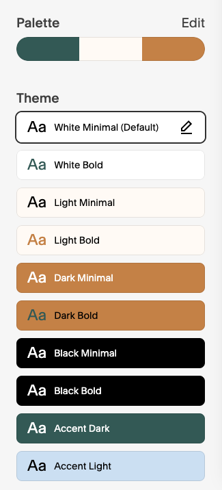
Look at all of these color palette options!
The Color Profiles
These made my heart sing when I first looked at them and started understanding how they work. Squarespace now allows you to create individual color profiles that can be applied to any section anywhere in your site! This is pretty powerful as it allows you to apply different styles based on certain landing pages and even create a whole microsite that looks different from your main site.
Utilizing these makes you think about your strategy in a whole new way as you set up pairings that allow for your sections to look completely optimized!